Coffs Harbour Netball Association

CHNA commissioned Cewal Graphics to create an artwork for their club to be used as their banners, signage, and for the netball uniforms; shirts and dresses. It was a pleasure to create an artwork for them that will stand the test of time and be used over and over again.
When asked to create an artwork for CHNA, I was immediately drawn to their club colours and wanted to know more about them. Upon researching the website and hearing information from community members about CHNA, I got a pretty good sense of who the club was and how well they engage with the Coffs Harbour community.
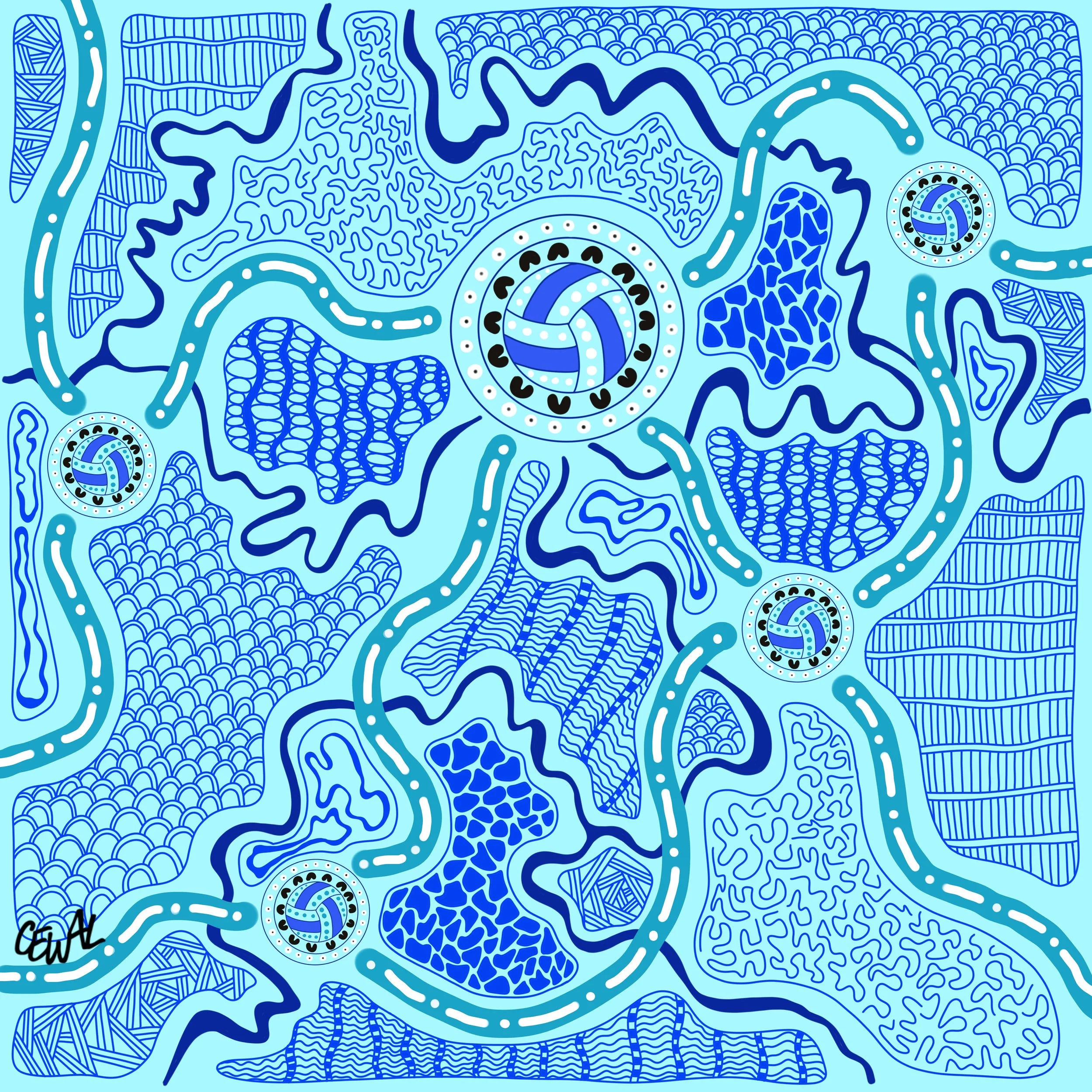
I wanted to include the four clubs that make up CHNA, and was asked to include an image of the netball in the design, and keep to the blue, white and black colours of the Association.
Being so close to the ocean, these were easy asks to follow.
In this artwork, you will notice the netball symbol at the heart of each meeting point. Around the netball, you will notice black ‘u’ shapes. These are representative of your players, the ones closest to the netball and the ones who sometimes need the wrapping around of the community. On the outer ring, you will notice white dots with black dots in the middle. This represents the families, umpires, coaches, canteen staff, the GA, and anyone else who plays a vital role in the upkeep of the club. These people sometimes have the difficult jobs of wrapping around the players and their support is endless. Without these members of the community, the players wouldn’t have a club to come to where they can play the sport they love.
I placed Vost netball park fields almost at the centre of the artwork, as this is where each club comes together through the week for training, and for games on the weekend. Travelling to each other netball club, you will notice organic dark navy blue lines that guide your eye to the next meeting place, or in this case, netball club. These lines are representative of the creeks and rivers that run between the clubs in the Coffs Harbour area. To the east, you will notice Surfside. Down to the southeast; Sawtell Toormina. Down to the southwest; Souths, and finally out to the west; Westside.
Each of these clubs have travelling lines that symbolize each club coming together to play netball at your main courts; Vost Park. These travelling lines are represented by the turquoise lines with the white dot and line combination. I used this to mimic the running and stopping that happens within the game of netball. A constant move and stop, constantly on the run.
The patterns in the background represent your community. The external families, businesses, committees, supporters, sponsors, whoever else plays a role in running CHNA. My aim was to allow this artwork to flow and be catching to the eye with a story that uplifts and promotes the togetherness and culture of netball.